Traffic Experiment Project
Towards the end of the year, students were paired an assigned to conduct an experiment. This experiment required that we search for data that was helpful and informative. My partner and I chose to analyze the traffic congestion problem in the High Tech High parking lot, and determine when the most efficient time to leave after school is.
Essential Question: How long does it take to get around the High Tech High parking lot? When is the best time to leave?
Relevance: Our experiment will allows students, teachers, and parents, to determine what time is best to leave school, and helps High Tech High’s traffic problem by relieving traffic congestion at the most popular times. We were interested in finding this information because students commonly deal with such problems. High Tech High’s parking lot is infamous for its mind numbing congestion and endless line of cars attempting to get through. There have been no previous experiments that search for the same exact information as us. However, we were both very experience with the traffic situation in the parking lot. The information from our experiment is mainly useful for those who use the parking lot; such people are students, teachers, and parents. From our data they can extrapolate the most efficient time to leave the parking lot rather than
Methodology: The sample size of our experiment was 13 days, over the course of three weeks. One Friday was not tested on because we didn’t have school and the Thursday of Village Fest was also unaccounted for. The three weeks used for testing were chosen randomly, and our decision did not account for certain events occurring at that time. It did not matter whether or not certain schools were on Immersion week or Endersession. Our treatment was the time of day we decided to run the tests, which occurred at five minute intervals from 3:20 to 4:00 each day. This was based on the staggered school release times of HTH, HTHI HTHMA, HTMMA, HTM, and Explorer Elementary. Our control was the consistency of our testing times. Every day we began our laps around the parking lot at exactly the same time. Other controlled variables included the car used, the driver, the course, and a speed limit of 10 mph. These were kept consistent during all trials. Brandon drove the same car for every trial, and each lap began and ended at the West corner of the High Tech High parking lot. These variables ensured consistency within our experiment. Our experiment focused on the patterns/correlation between the treatment and traffic.
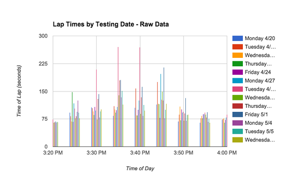
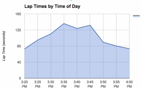
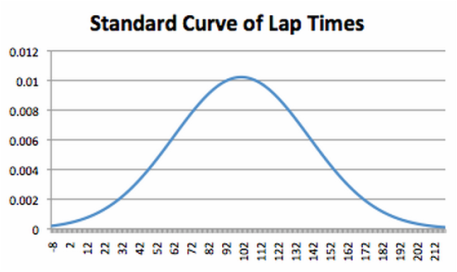
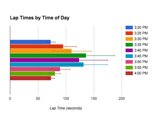
Data Analysis: Our data was organized by time of day and day of the week. We decided to just analyze it by time of day, not day of the week, because we didn’t believe we gathered enough data to such conclusions. For time of day we calculated the average time of lap and the standard deviation. In a bar graph we were able to display the average for every time of day along with the error bars. From this display we can tell that the parking lot is most crowded at 3:35 and 3:45. However, due to the different factors during the different weeks of testing, these two time frames also had two of the largest error bars (standard deviations). We gathered 13 samples of data for each time of day. I believe that this is enough data to make the conclusions that 3:45 and 3:35 are the worst times to leave the parking lot where as 3:20 and 4:00 are the best times to leave. We also created a graph of our raw data by time of data which individually graphs each piece of data. This graph is a good way to display our data because it shows not only the inconsistency between days but also how it peaks in the middle. When looking at this graph you see that the lap times get longer towards the middle of the testing times but there are still some short lap times at the times with higher averages. The last way we tried to organize our data was in a bell curve using the average and standard deviation of all the laps. The average (mean) was 101.5 and the standard deviation was 39. Unfortunately this data doesn’t work well in a bell curve because our data has a lot of outliers of higher lap times but not of shorter. That is because our lap times never got shorter than 65 seconds but it could go infinitely high. When I created the bell curve some of the lap times would of been negative, so that didn’t work. Also the way that excel creates that graph creates values that don’t make sense so the bell curve didn’t work at all. Lastly, during the analysis of our data we tried to do correlation. Our correlation was -12.37930588%. We can not have a correlation between our lap times and time of day because it forms a bell curve not a linear graph, be it negative or positive. Correlations implies that when one thing happens another happens at a consistent rate. Because as time goes on lap times go up and down it doesn’t correlate. Our experiment cannot have a p-value either because our experiment didn’t have a treatment. Because every variable was controlled there was no chance involved in acquiring our data.
Data Display: Our first graph shows the raw data that we collected. It’s a bar graph that includes all 13 days of testing, and the time it took to do each and every lap. This is a good way to visually see and understand the range of data we acquired, however it doesn’t directly answer our essential question. For this reason, it accurately represents our data however it’s not an efficient graph when it comes to understanding our findings. Our second graph is a bell curve that shows the standard deviation of lap times. Through quite a bit of contemplation, one can understand the information it is displaying. However, like the first graph, it’s not an efficient graph when it comes to understanding our data. In addition, it doesn’t address our essential question, nor does it appropriately display the data we were looking for. Our last graph displays our data in an area chart that very appropriately displays our data. It answers our essential question, and its information is very easy to interpret. We also made a bar graph that shows the same information but also incorporated the error bars. Both are shown below.
Relevance: Our experiment will allows students, teachers, and parents, to determine what time is best to leave school, and helps High Tech High’s traffic problem by relieving traffic congestion at the most popular times. We were interested in finding this information because students commonly deal with such problems. High Tech High’s parking lot is infamous for its mind numbing congestion and endless line of cars attempting to get through. There have been no previous experiments that search for the same exact information as us. However, we were both very experience with the traffic situation in the parking lot. The information from our experiment is mainly useful for those who use the parking lot; such people are students, teachers, and parents. From our data they can extrapolate the most efficient time to leave the parking lot rather than
Methodology: The sample size of our experiment was 13 days, over the course of three weeks. One Friday was not tested on because we didn’t have school and the Thursday of Village Fest was also unaccounted for. The three weeks used for testing were chosen randomly, and our decision did not account for certain events occurring at that time. It did not matter whether or not certain schools were on Immersion week or Endersession. Our treatment was the time of day we decided to run the tests, which occurred at five minute intervals from 3:20 to 4:00 each day. This was based on the staggered school release times of HTH, HTHI HTHMA, HTMMA, HTM, and Explorer Elementary. Our control was the consistency of our testing times. Every day we began our laps around the parking lot at exactly the same time. Other controlled variables included the car used, the driver, the course, and a speed limit of 10 mph. These were kept consistent during all trials. Brandon drove the same car for every trial, and each lap began and ended at the West corner of the High Tech High parking lot. These variables ensured consistency within our experiment. Our experiment focused on the patterns/correlation between the treatment and traffic.
Data Analysis: Our data was organized by time of day and day of the week. We decided to just analyze it by time of day, not day of the week, because we didn’t believe we gathered enough data to such conclusions. For time of day we calculated the average time of lap and the standard deviation. In a bar graph we were able to display the average for every time of day along with the error bars. From this display we can tell that the parking lot is most crowded at 3:35 and 3:45. However, due to the different factors during the different weeks of testing, these two time frames also had two of the largest error bars (standard deviations). We gathered 13 samples of data for each time of day. I believe that this is enough data to make the conclusions that 3:45 and 3:35 are the worst times to leave the parking lot where as 3:20 and 4:00 are the best times to leave. We also created a graph of our raw data by time of data which individually graphs each piece of data. This graph is a good way to display our data because it shows not only the inconsistency between days but also how it peaks in the middle. When looking at this graph you see that the lap times get longer towards the middle of the testing times but there are still some short lap times at the times with higher averages. The last way we tried to organize our data was in a bell curve using the average and standard deviation of all the laps. The average (mean) was 101.5 and the standard deviation was 39. Unfortunately this data doesn’t work well in a bell curve because our data has a lot of outliers of higher lap times but not of shorter. That is because our lap times never got shorter than 65 seconds but it could go infinitely high. When I created the bell curve some of the lap times would of been negative, so that didn’t work. Also the way that excel creates that graph creates values that don’t make sense so the bell curve didn’t work at all. Lastly, during the analysis of our data we tried to do correlation. Our correlation was -12.37930588%. We can not have a correlation between our lap times and time of day because it forms a bell curve not a linear graph, be it negative or positive. Correlations implies that when one thing happens another happens at a consistent rate. Because as time goes on lap times go up and down it doesn’t correlate. Our experiment cannot have a p-value either because our experiment didn’t have a treatment. Because every variable was controlled there was no chance involved in acquiring our data.
Data Display: Our first graph shows the raw data that we collected. It’s a bar graph that includes all 13 days of testing, and the time it took to do each and every lap. This is a good way to visually see and understand the range of data we acquired, however it doesn’t directly answer our essential question. For this reason, it accurately represents our data however it’s not an efficient graph when it comes to understanding our findings. Our second graph is a bell curve that shows the standard deviation of lap times. Through quite a bit of contemplation, one can understand the information it is displaying. However, like the first graph, it’s not an efficient graph when it comes to understanding our data. In addition, it doesn’t address our essential question, nor does it appropriately display the data we were looking for. Our last graph displays our data in an area chart that very appropriately displays our data. It answers our essential question, and its information is very easy to interpret. We also made a bar graph that shows the same information but also incorporated the error bars. Both are shown below.
|
|
Validity: I believe that our experiment was a completely valid way of determining our information. We were able to control majority of variables that could have affected our experiment, and our data was very consistent over all three weeks, inferring that it is accurate. During our experiment we were able to start at exactly the right times each day and were very accurate when it came to starting/stopping locations. Our teachers were also very understanding when it came to getting out of class early. One of the challenges we had to overcome was exactly simulating how a car would get out of the parking lot. Many times we would be able to go around cars that were waiting to exit the lot, however to keep our data as realistic as possible we would have to wait in the lines. Unfortunately we were unable to control which three weeks we tested during. Ideally we would have chosen three weeks in the middle of year when traffic is considered more “normal.” Many seniors left for Endersession during our last testing week, and HTHI had an Immersion week.This changed the amount of cars in the parking lot. We were also only able to gather 13/15 days of data due to Village Fest and a snow day. Unfortunately we were unable to control this variable and it wasn’t possible to use other weeks within the time limit of the project. We didn’t experience any other limitations during the duration of our experimentation process.
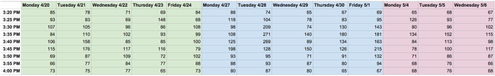
Data: